Garçonmaires
A fashion brand combining premium streetwear, classic tailoring and Warsaw’s urban character.
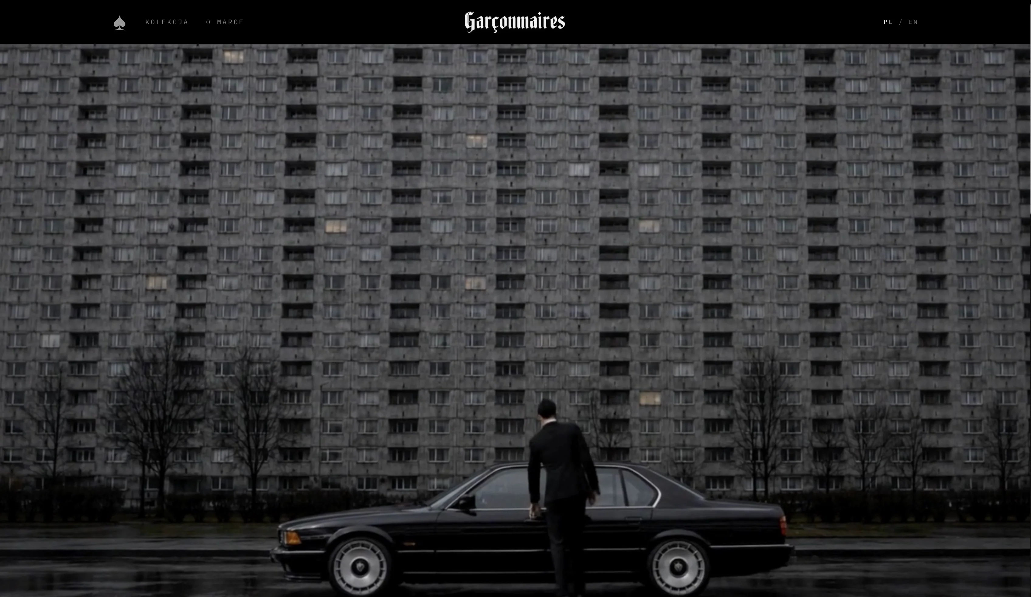
A brand built around contrast
Garçonmaires draws on the tension between premium streetwear and classic tailoring: elegant form meets Warsaw’s raw urban rhythm.
That contrast carries through the visual language, website and first collection’s communication. A monochrome aesthetic, restrained layout and spade motif create a brand that looks consistent on its products and online.
Challenge
Build a fashion brand from the first encounter: from character and visual system to ecommerce ready to present its collection.
Bring a luxurious tailoring tone together with a streetwear aesthetic while preserving the brand’s character.
Keep the same language across the logo, typography, card motif, website screens and collection communication.
Create a minimal digital experience that showcases the product and guides people towards a purchase.
Creative direction
The creative direction centres on monochrome, urban contrast and the spade symbol used in the collection’s communication.
Garçonmaires materials feature black backgrounds, strong product imagery, elegant minimalism and playing card details. Together, they create a restrained yet distinctive fashion world.


SpadeA monochrome campaign language
Visual identity
The system is restrained and monochrome to support the product’s fashion character and keep it in focus.
The logo and symbol work at large scale in black and white, while the spade motif connects the identity to the digital brand experience.

Black and white create an exclusive character and maintain strong contrast in website screens and product imagery.
The spade motif appears in digital materials as a recognisable collection detail.
The minimal system works well in ecommerce layouts, where the product and brand atmosphere take priority.
Websites
The website is an entrance to the brand’s world: minimal ecommerce, strong imagery and the first collection’s presentation.
Screens show the website hero, collection presentation and branded solitaire game. Product, atmosphere and interaction form a consistent whole.
The brand in practice
The materials show how one brand language runs through the website hero, collection presentation, spade motif and interactive solitaire game.
In practice, the identity extends into composition, contrast, framing and the logic of the online experience.
Project scope
- 01Brand strategy
- 02Visual identity
- 03Creative direction
- 04Website design
- 05Ecommerce
- 06UX/UI
- 07Content direction
- 08Newsletter automation / SEO foundations
Outcome
The result is a consistent brand direction connecting the product, communication and digital experience.
Garçonmaires has a recognisable visual system across its website, collection presentation and interactive elements. This case study makes no claims about sales or campaign results.
Visit the website ↗